Recently I opened a folder of images submitted by a colleague to display in our digital gallery space, Bert’s Study Lounge. A soldier stared obliquely back at me, his rifle displayed across his midsection. I sighed, my heart sinking.
I take for granted that working in a university environment means that I don’t have to think about appropriateness much when it comes to programs. Last month, for example, we hosted a discussion titled “What is Sex For?” without having to consider the reactions of parents or concerned citizens. In academia, envelope-pushing is (for the most part) welcomed and encouraged.
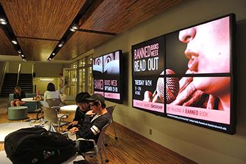
This atmosphere has created awkwardness and growing pains for our digital gallery space, however. Located front and center in the Shapiro Undergraduate Library, Bert’s Study Lounge is an immersive environment filled with comfortable furniture, a row of digital screens and two large multi-screen panels we call the “video wall.” When the space first opened, we struggled to fill its sixteen screens (eight of which comprise the two video walls) with content to match our library’s 24/7 schedule. Perhaps because we’re librarians, we initially carved up the real estate like a mad zoning board: one screen for event flyers, another for library resources, a third for instructional videos. This produced a frenetic space with no focus. Gradually, we experimented with digital exhibits of student work and other content that took over the entire space, and we found that when we stuck to one message at a time, we were much more successful.
As we’ve grown our digital exhibit program we’ve settled into a comfortable rhythm: offering a new exhibit each Monday morning and running it through the following Sunday evening. This gives us the opportunity to work with dozens of partners each year, from library colleagues to campus departments, faculty members and individual students. Though we’ve gotten used to our space’s format and medium, each successive partner confronts it anew, and this is where the awkwardness comes in.
Most of the people that we work with haven’t spent very much time thinking about the impact of context on what they’d like to display. Higher education professionals, for example, will send us lovely slides overflowing with text that goes unread as our patrons quickly breeze by. Student artists, while they have approached the solo show opportunities we have given them with enthusiasm, are not used to thinking about the impact that their work will have on the viewer from a practical perspective. In short, our partners are sometimes like the not-so-good listeners described in self-help workshops: they are so focused on what they want to share they forget to think about the two-way aspects of a communication relationship.
Many of our student artists want their audience to feel uncomfortable when experiencing their art. But our space, in which colleagues work and students sometimes spend an entire day camped out, can’t be a place of emotional discomfort. Everyone needs to feel safe in the library, and so while most of our patrons might not give a second glance to a soldier holding a rifle, it’s important to us to consider the few users who might find the image deeply disturbing or even triggering. In a lot of cases, this means altering a partner’s vision to accommodate the context. While this process can be viewed as a dumbing down of a more pure artistic product, I think there is a lot of value, especially for students, in learning how to fine-tune, not only to suit the needs of a space but also to address the attention and emotional state a viewer brings to the environment.
I have been thinking about this a lot in relation to the recent installation of a sculpture of a highly realistic, nearly naked man at my alma mater, Wellesley College. The sculpture, situated along a heavily trafficked outdoor route between the academic quad and a cluster of residence halls, prompted cries of protest by many students and alumnae. Others on campus and in the media argued that the students should be cool and take some selfies, and that fear wasn’t the reaction the artist intended to provoke.
To me, context is the most important part of this story and what links it with our situation in Bert’s Study Lounge. Even in formal gallery settings, artists lose control of their work, and especially reactions to it, once it is on display. But the campus of a women’s college and a library lobby are not formal gallery spaces. Wellesley students couldn’t choose whether or not to encounter the sculpture, and thus their feelings about it, much like our patrons here in the library can’t (or shouldn’t have to) choose not to study here to avoid something on display. At the same time, academics are committed to exploring ideas and confronting hard questions, and libraries in particular shy away from censorship, so we don’t want our digital gallery space to become watered down, neutered or inert. Striking a balance between provocation, inquiry and sensitivity is important to us. To return to the conversation metaphor, I think it amounts to having respect for the person on the listening end of the visual exchange.
Aside from content, our space also places unusual constraints on design, beyond the screen dimensions and other basic technical specifications. I recently sent an email to a colleague in another campus unit describing our digital gallery “like a cross between a billboard and a fireplace.” When we have our patrons’ attention we don’t hold it for very long, and we likely don’t have all of it. Abundant text, for example, stands little chance of being read. Plenty of opportunity remains for visual communication through visual repetition and atmosphere, but these are subtle areas in which to focus for both professionals and student artists.
These areas of challenging ground have provided for intellectual growth among the members of the team that manages the space, however, and it has helped us think critically about communicating with our users, even outside of the context of designing for the space. It’s exciting to think about pushing the envelope of this (relatively) new medium, even if designing with respect and focusing on nuances like atmosphere aren’t as overtly sexy as other types of boundary-pushing. Perhaps most importantly, standing our ground on behalf of our patrons gives us a stronger footing when negotiating displays with partners, helping us to avoid being a passive method of display for someone else’s agenda and to instead embrace the collaboration as a true partnership.