DIY Color Analysis is an interactive workshop where patrons are taught basic color theory and then use simple DIY techniques to find their personal color palette, or “color season”. Patrons can make a personal lookbook and grab some color swatches to take home.
Advanced Planning
This program was created for our 2025 Summer Reading Challenge, Color Our World. Since my library already hosts many art workshops, I wanted a color-focused program that wasn’t craft-based.
I planned it a month in advance, researching color theory, color seasons and color analysis tests—mainly through YouTube and Reddit. The workshop included a crash course on color theory, an overview of color analysis and guided color tests to help patrons identify their color season and palette.
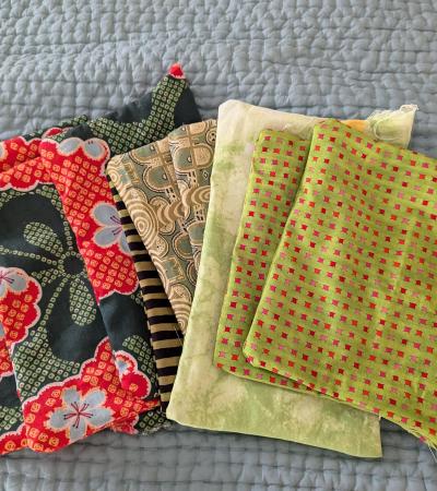
Instead of fabric swatches, I used free paint chips from Home Depot—collected over five trips to two stores—and organized them into color season bundles (e.g., True Summer, Light Summer, Soft Summer, plus general Summer palettes).
Optional: I found color season palettes online that had a wider color palette than the colors I was working with. I printed those out and laminated them for patrons to take home.
The hardest part was the research. It took some time for me to understand the basics of color theory.
The most time-consuming part was collecting all of the paint chips, organizing, and labeling them.
Marketing
My library utilizes print and digital marketing with the use of a Marketing Coordinator. She created posters, flyers, and graphics to use on the library’s social media. She also posted graphics and registration reminders on our stories.
Marketing was very successful. I had 15 registered patrons and a waitlist of 14 patrons in the week leading up to the program.
Budgeting
This program is extremely cost-effective. I only spent $22 for a 12 pack of hand-held mirrors. Since I had 15 registered patrons, I used some mirrors we had left over from previous programs.
Day-of-event Activity
For the day of, myself and another staff member set up for the program. We had four tables set up with two tables pressed against each other horizontally. Two separate tables were placed vertically on either end of the horizontal tables. We have a very small events space at the moment, so it’s easier to have the tables sorted this way most of the time.
I sorted all of my color seasons into baskets and placed them on each table, along with hole punchers and book binder rings (for the lookbook at the end). I had made enough color palettes so that each person could take home one, but they were still expected to swap baskets and share color swatches. I also had to hook up a staff laptop to a TV with an HDMI cord so I could display the PowerPoint.
One unexpected challenge was the mirrors—they were ordered late and almost didn’t show up in time. Since our library is in a mall, I walked over to Target and purchased two full-size mirrors. Thankfully, the mirrors arrived the second the program started.
Program Execution
I led the program with a PowerPoint presentation on basic color theory and color analysis. I explained the color seasons and then walked them through three color analysis tests step-by-step. A coworker and I went around the room during each test, helping people determine what colors looked best and answering questions about color analysis and the color analysis tests.
During the program, the patrons assembled color lookbooks based on colors that are either in their season, just naturally look good with their skin, or both. To make the lookbooks, you use the hole punchers to punch holes in the color swatches and link them together with the bookbinder rings.
Counting the registered patrons, myself and my coworker, and the staff who walked in and out hoping for a quick color analysis, the total number of patrons added up to 20 people.
Feedback was overwhelmingly positive. Most of the feedback that we got requested that we have this workshop again. Other patrons also said they liked the educational aspect of the program.
Advice
Be prepared to do a lot of research and to spend a lot of time at Home Depot.
While color analysis is rooted in the science of color theory, color analysis itself is incredibly subjective. There are physical cues to look for when determining whether or not a color looks “good” or “bad” on a person's skin, but you’re mostly relying on vibes and an unbiased opinion. Don’t expect to have all of the answers, but you should have a basic understanding of color analysis and color theory to implement this program.
Links that were helpful for me in the creation of this program:
Supporting Materials
More Programs
Balloon Smash Art
Audiences:
DIY Prom Flowers
Audiences: